

The eyes have it

Creatively designed packaging is the bridge between a manufacturer and the consumer; a way to tell a story, spark the imagination and ultimately lead to a purchase. There are a multitude of elements that go into successful design, so as well as running through some of these elements, we take a look at some of the year’s newest and most creative products in terms of creative design, writes Doug Whelan
 Print
Print15 March 2017
Fooddive.com’s Keith Loria calls the elements of packaging design a “balancing act.” That’s a good description, given just how important good design is to a brand, how much financially can be invested in it and how important it is to appeal to a wide variety of consumers.
The main objective, put simply, is to communicate the brand’s message to the consumer, and ultimately help them make the decision to choose one brand over another. Attractive, colourful exteriors are what initially catches, the eye, while more detailed design is what brings them in closer.
Detailed design can make a product seem more “premium” also, which can sometimes justify selling at a higher price.
So then, the right packaging is just as important as what’s inside, when it comes to having a quality product. Consumers expect packaging features that not only allow them to judge the content of a product, but also for it to have functional attributes such as a sturdy open/close feature (especially if it’s a multi-use package). These elements can also justify a higher price tag.
Welcome
Put another way, packaging is for the consumer a “welcome” to the product. Good packaging needs to grab the attention and also keep it. This can be achieved not only individually but also collectively: dozens or even hundreds of units stacked together can create what is known as a “billboard effect” by forming a grid. This can be very effective to the subconscious, creating a pleasing effect to the consumer not unlike looking at a piece of art.
In the modern realm, sustainability is a key element in decision making. According to Nielsen, 63% of consumers agree with this. It taps into a consumer’s perception of the brand as well as the manufacturer, creating a connection and a sign of corporate responsibility.
Ultimately, brands want to use their packaging to tell a story. That idea is strongly on show with some of the packaging concepts here. Read on…

At Midpoint Creative, Paul Ruane and his team aim to encapsulate the product through simple colours and lines
![]()
Perception and familiarity
According to Paul Ruane, creative director at Midpoint Creative, packaging design involves far more than just making a product look good. “I believe there are two key factors when we choose what to buy – perception and familiarity,” says Ruane. “These days, consumers are bombarded with information at every turn, so it’s important to try and influence their perception, rather than try to get ‘in their face.’”
Ruane says that consumers don’t have time to stand in a shop reading all the packaging on the shelves; they just want to be able to make a quick decision. If the decision is in any way too “complex” for the consumer, they will instinctively choose the product they already know.
“Our approach when designing brand identities and product packaging is to focus on the consumers’ perception of our clients’ products,” Ruane says. “Big brands already have the monopoly on ‘familiarity’ and only a rare few new products can break through that, unless they have massive budgets for marketing and advertising.”
On a recent project for Origin Protein Bars, Midpoint Creative took the decision to keep the packaging simple, by using mostly white accent colours matching the product’s ingredients. The bars are made from 100% natural ingredients, and consumers are far more aware now about ‘clean’ eating, so the objective was to create packaging that would give people that perception – clean and natural.
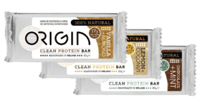
Origin’s design concept was to match the packaging with the ingredients
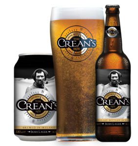
Ruane calls Crean’s brand identity “strong and truthful”
Likewise, for Tom Crean’s Irish Lager, which was named in honour of a ‘True Irish Hero’, the company wanted to create a really strong but truthful brand identity. The main focus was to encapsulate the story of Tom Crean’s legendary trek to save the lives of his teammates on an Antarctic expedition. “We could have tried to make it stand out just for the sake of standing out,” Ruane says, “but the overall packaging design is subtle and clear.”
Midpoint Creative believes if the focus remains on keeping your design and messaging clear and simple evoking the right perception, consumers will appreciate it and will be more likely to buy a product. If the product lives up to their expectation, they will buy it again and again. “That’s how the right perception develops into familiarity,” Ruane says.
For more examples of Midpoint Creative’s work, visit www.midpointcreative.com or facebook.com/MidpointCreative.
Connected whiskey
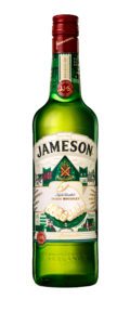
Jameson’s Limited Edition bottle is NFC enabled, allowing consumers to engage online using the product
Jameson’s 2017 Limited Edition Bottle is set to be the first-ever “connected product”. Consumers with Android devices will have the ability to access competitions and other content by tapping their NFC-enabled device on the label’s Jameson crest.
NFC technology is probably most familiar to consumers through their contactless debit cards and Leap cards, but this connected bottle takes it out of hiding and uses it as a method of communication.
The campaign has been developed with an ongoing partnership between Irish Distillers Pernod Ricard and SharpEnd – the UK’s first “Internet of Things” agency. Unlike much-maligned QR codes, NFC technology doesn’t require any apps to access the content; this ease of use is expected to increase competition entries. iPhone users will be able to enter using a unique URL on their bottle purchased. Consumers will be rewarded with instant wins, or be in with the chance to win the Ultimate Jameson Experience. Catherine Casserly, Jameson marketing director for Ireland says the company is thrilled with the new offering.
“As a brand, we are thrilled to be leading the way in using NFC enabled products as a marketing tool in Ireland,” Casserly says. “We are always looking for new ways to engage consumers in a meaningful way.”
The label on the bottle has been designed and illustrated by Dublin artist Steve McCarthy and is the sixth annual limited edition design to be released by Jameson. The 2017 edition depicts two outstretched hands etched with the Jameson family motto, Sine Metu, and was inspired by the origin of the phrase “chance your arm.”
Jameson Limited Edition Bottle is available now at RRP €29.99.
Prevent and Save
Repak has announced plans to help and encourage members to prevent packaging waste through its Prevent and Save packaging optimisation programme. The company’s dedicated packaging technology team can assist businesses on any aspect of sustainable packaging design and explore ways to optimise existing packaging systems. This can save on both material and money for your business. It is also free of charge to Repak members.
Packaging plays an essential role in containing, preserving and protecting the products consumers take for granted on a daily basis. Along with these critical functions, packaging also provides the consumer with information about the product and is the primary tool used to enhance its commercial appeal. However, most of today’s packaging can be used only once by the customer and then all of its appeal ends up in a waste bin.
Repak has helped Ireland to make significant progress in growing packaging recycling from a low base of 15% in 1997 to 70% in 2015. However with new packaging waste legislation coming down the track under the EU’s circular economy package, targets for the recycling of packaging will increase across all EU member states. Ireland’s next challenge will be to grow packaging recycling to 75% before 2030 and increase recycling of all individual packaging materials.
This will force us all to think differently about how we use our precious packaging materials in order to make them last into the future. Sustainable packaging design decisions that consider packaging at the end of its life must become more central to day to day business.
With higher recycling targets for individual materials, businesses will need to give greater consideration to the recyclability of the packaging that they design. They will also need to find more opportunities to return and reuse packaging for refilling in order to reduce the amount of single trip packaging they use.
For most businesses, packaging involves a significant purchasing spend. It is therefore critical that it acts as a fit for purpose system, which is suitable for the entire product supply chain. Under current EU packaging waste legislation, only the minimum amount of packaging should be used to achieve this. Not designing in excess packaging at the outset prevents packaging waste from being generated at the end of life.
For more information on Repak’s Prevent and Save Programme visit www.repak.ie/preventandsave or call the company at 01 467 0190.
Related Articles
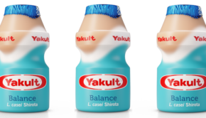
Yakult announces new look across all lines and product name change →

Fans 0
Followers